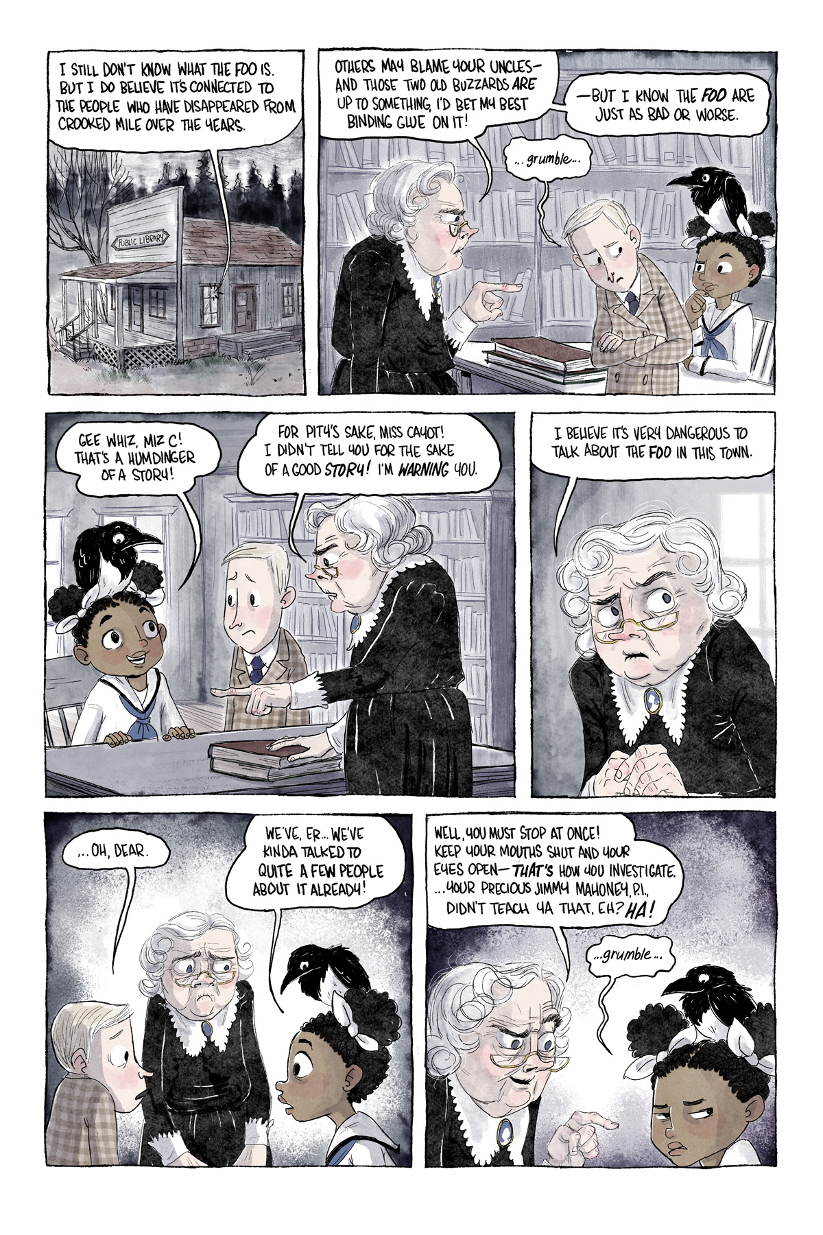
I just noticed how much finger-wagging Miz Cavanaugh is doing here. Looks like she even had to pause in the fourth panel to give the ol' pointer finger a little massage between waggings. She's gonna have to ice that puppy tonight!
Hi all,
Just found The Curse of the Crooked Mile (TCotCM) and read thru the archive. Wow! What a great story, and such nice art. Your webcomic is going onto my list of favourites.
I’m not sure if adding color is a good idea. It is easier to make out what is going on, but the murky grey scale was part of TCotCM’s charm. Perhaps the colors could be less saturated?
I’m curious about how you draw the comic. Pencil’s and scan it in? Pencils and wash? Wholly digital?
So far everything is pointing to the uncles murdering people to sustain their youth. But I expect things are much more complicated than that.
Thanks for your work, TCotCM is something to be proud of!
Wow, thank you so much for taking the time to leave such a thoughtful comment! I’m really glad you found my comic 🙂
Yes, I still can’t decide about the color either, and you’re the second person who’s said they prefer b&w… I think I’ll probably go back to grayscale in the long run, honestly! But I also do the comic partially as kind of a playground to try out new techniques, so I thought I’d try color for a while to build my skill with digital coloring…I’m mostly a traditional watercolor artist, and digital colors just aren’t super comfortable for me yet!
For comics, I find it’s just too time-consuming to work in traditional media. I’m already pretty slow, so if I was working in real ink, I’d probably post a page a month, ha ha! So yes, this is entirely digital. I use brushes from grutbrushes.com, which I can’t recommend highly enough if you’re a digital artist yourself! They really add a natural flow and texture so you can get some very convincing ink & wash effects.
Thanks again for reading, and I hope you continue to enjoy the story! 🙂
IDEA ONE: Make the colors mostly grey. Grey brown, Grey blue, etc. The idea is that at first glance it looks grey scale, but there is just a BIT of color.
IDEA TWO: Draw the comic in greyscale, but use Grey Brown, Grey Blue, for highlights. You know dodge and burn? Anywhere you would dodge, put in a bit of color. So color would mostly appear when you have one (or more) strong light sources, and would always face the light. So Owen’s shirt would be grey, with a bit of brown where strong light is hitting it.
I’m certainly not trying to tell you how to do your comic; I’m just trying to be helpful. Nor am I a professional artist, so my ramblings are not from an expert, by any means. But I found the colors jarring, and they seemed to take away from the unrelenting gloom the comic expressed up to now. (Which is much of the fun, of course.)
I’m not sure if you have seen the web comic “Oglaf” (NSFW). Often the artist will pick a color, (“purple this week!”), and use it as a theme for that week’s comic. Almost as if there was a purple gell between the art and the camera photographing the picture. So imagine a scene in the uncle’s lab. The back ground and most of the stuff is some shade of blue, but the characters don’t necessarily fit that color so they pop. (It is hard to describe, check out a few pages of Oglaf and you will see what I mean.)
Have you have seen the Groo comics books? The panels of the comic have tonnes of details in the background, and the colourist tends to paint the backgrounds one color. (So everything in this layer of the background is a dull green, even small stuff that should be other colors (like a bit of flesh color, a shirt you know is red, and some flowers.) No doubt this was done to save the colourist time, but it had the effect of making the foreground pop, and let us know that THIS intensely detailed part of the picture, is really, actually in the back ground, and not so important.
Aw, thank you! That’s so nice to hear! The change was a little bumpy at the beginning, I think, but I feel like the colors are really clicking now that I’ve got my palette figured out more 🙂
I love the colors. It’s grey, black and white with a little splash of color. It’s cool that most of it is in black and white and then there’s jus a few small things in color.


8 thoughts on “Lessons from a Librarian.”
Peya Luna
that old biddie is quite sneaky!
Ricardo the Mysterious
Hi all,
Just found The Curse of the Crooked Mile (TCotCM) and read thru the archive. Wow! What a great story, and such nice art. Your webcomic is going onto my list of favourites.
I’m not sure if adding color is a good idea. It is easier to make out what is going on, but the murky grey scale was part of TCotCM’s charm. Perhaps the colors could be less saturated?
I’m curious about how you draw the comic. Pencil’s and scan it in? Pencils and wash? Wholly digital?
So far everything is pointing to the uncles murdering people to sustain their youth. But I expect things are much more complicated than that.
Thanks for your work, TCotCM is something to be proud of!
Warm regards.
Uncle Mortemius
Wow, thank you so much for taking the time to leave such a thoughtful comment! I’m really glad you found my comic 🙂
Yes, I still can’t decide about the color either, and you’re the second person who’s said they prefer b&w… I think I’ll probably go back to grayscale in the long run, honestly! But I also do the comic partially as kind of a playground to try out new techniques, so I thought I’d try color for a while to build my skill with digital coloring…I’m mostly a traditional watercolor artist, and digital colors just aren’t super comfortable for me yet!
For comics, I find it’s just too time-consuming to work in traditional media. I’m already pretty slow, so if I was working in real ink, I’d probably post a page a month, ha ha! So yes, this is entirely digital. I use brushes from grutbrushes.com, which I can’t recommend highly enough if you’re a digital artist yourself! They really add a natural flow and texture so you can get some very convincing ink & wash effects.
Thanks again for reading, and I hope you continue to enjoy the story! 🙂
Ricardo the Mysterious
Two suggestions on color…
IDEA ONE: Make the colors mostly grey. Grey brown, Grey blue, etc. The idea is that at first glance it looks grey scale, but there is just a BIT of color.
IDEA TWO: Draw the comic in greyscale, but use Grey Brown, Grey Blue, for highlights. You know dodge and burn? Anywhere you would dodge, put in a bit of color. So color would mostly appear when you have one (or more) strong light sources, and would always face the light. So Owen’s shirt would be grey, with a bit of brown where strong light is hitting it.
I’m certainly not trying to tell you how to do your comic; I’m just trying to be helpful. Nor am I a professional artist, so my ramblings are not from an expert, by any means. But I found the colors jarring, and they seemed to take away from the unrelenting gloom the comic expressed up to now. (Which is much of the fun, of course.)
I’m not sure if you have seen the web comic “Oglaf” (NSFW). Often the artist will pick a color, (“purple this week!”), and use it as a theme for that week’s comic. Almost as if there was a purple gell between the art and the camera photographing the picture. So imagine a scene in the uncle’s lab. The back ground and most of the stuff is some shade of blue, but the characters don’t necessarily fit that color so they pop. (It is hard to describe, check out a few pages of Oglaf and you will see what I mean.)
Have you have seen the Groo comics books? The panels of the comic have tonnes of details in the background, and the colourist tends to paint the backgrounds one color. (So everything in this layer of the background is a dull green, even small stuff that should be other colors (like a bit of flesh color, a shirt you know is red, and some flowers.) No doubt this was done to save the colourist time, but it had the effect of making the foreground pop, and let us know that THIS intensely detailed part of the picture, is really, actually in the back ground, and not so important.
Anyway, anything you chose to do is fine with me.
Warm regards.
Da5id
Counterpoint: I like the colors!
Uncle Mortemius
Aw, thank you! That’s so nice to hear! The change was a little bumpy at the beginning, I think, but I feel like the colors are really clicking now that I’ve got my palette figured out more 🙂
Krishna Jha
I love the colors. It’s grey, black and white with a little splash of color. It’s cool that most of it is in black and white and then there’s jus a few small things in color.
Guinevere Smith
I think you should keep playing and do color or not based on what feels right to you, the artist. Your style is part of what makes this comic so good!
Archive
Issue #3 available in print now!